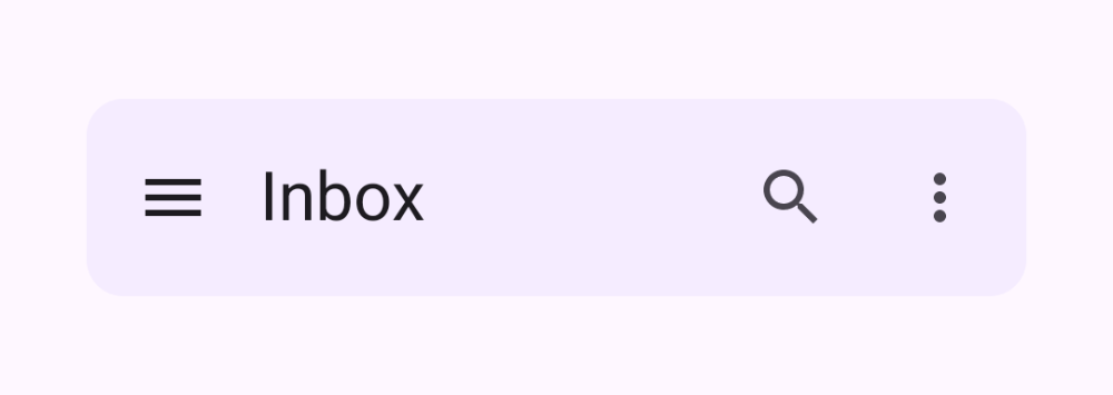
Skip to content
Navigation

Top App Bar

Small and center-aligned bars with navigation and actions

Top app bars display a screen title plus a leading navigation icon and trailing action icons. Material 3 ships small, center-aligned, medium, and large variants; the small and center-aligned forms are shown here.

Top App Bar demos rendered in Compose Playground
Pixel-accurate preview · light theme

Examples

01

Small top app bar

A title aligned to the start, with navigation and action icons.

Kotlin
TopAppBar(
    title = { Text("Inbox") },
    navigationIcon = {
        IconButton(onClick = {}) { Icon(Icons.Filled.Menu, "Open menu") }
    },
    actions = {
        IconButton(onClick = {}) { Icon(Icons.Filled.Search, "Search") }
        IconButton(onClick = {}) { Icon(Icons.Filled.MoreVert, "More") }
    }
)
02

Center-aligned top app bar

The title is centered, ideal for top-level screens.

Kotlin
CenterAlignedTopAppBar(
    title = { Text("Home") },
    navigationIcon = {
        IconButton(onClick = {}) { Icon(Icons.AutoMirrored.Filled.ArrowBack, "Back") }
    },
    actions = {
        IconButton(onClick = {}) { Icon(Icons.Filled.Settings, "Settings") }
    }
)