Skip to content
Communication

Badge

Dot, count, and overflow badges anchored to an icon

A Badge draws attention to a small piece of dynamic status — an unread count or a simple dot — on top of another element. Wrap an anchor in a BadgedBox and supply the badge; an empty Badge renders as a dot, while content renders as a label.

Badge demos rendered in Compose Playground
Pixel-accurate preview · light theme

Examples

01

Dot, count & overflow

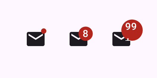
An empty Badge is a dot; pass Text for a count, capping large values at 99+.

Kotlin
BadgedBox(badge = { Badge() }) {
    Icon(Icons.Filled.Email, contentDescription = "Mail")
}
BadgedBox(badge = { Badge { Text("8") } }) {
    Icon(Icons.Filled.Email, contentDescription = "Mail")
}
BadgedBox(badge = { Badge { Text("99+") } }) {
    Icon(Icons.Filled.Email, contentDescription = "Mail")
}
02

Live counter

Drive the badge from state and hide it when the count is zero.

Kotlin
var count by remember { mutableIntStateOf(0) }
BadgedBox(badge = { if (count > 0) Badge { Text("$count") } }) {
    Icon(Icons.Filled.Email, contentDescription = "Mail")
}
Button(onClick = { count++ }) { Text("Add") }
OutlinedButton(onClick = { count = 0 }) { Text("Clear") }