Skip to content
Containment

Card

Filled, elevated, and outlined containers for grouped content

Cards hold a single coherent piece of content and actions. Material 3 offers three styles — filled, elevated, and outlined — and cards can be made clickable to act as tappable list items.

Card demos rendered in Compose Playground
Pixel-accurate preview · light theme

Examples

01

Styles

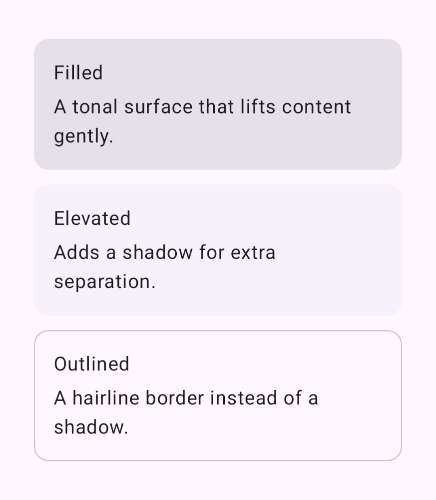
Filled, elevated, and outlined share the same content slot.

Kotlin
Card { CardBody("Filled", "A tonal surface that lifts content gently.") }
ElevatedCard { CardBody("Elevated", "Adds a shadow for extra separation.") }
OutlinedCard { CardBody("Outlined", "A hairline border instead of a shadow.") }
02

Clickable card

Pass onClick to make the whole card a tappable row.

Kotlin
Card(onClick = {}) {
    Row(
        modifier = Modifier.fillMaxWidth().padding(16.dp),
        verticalAlignment = Alignment.CenterVertically
    ) {
        Surface(shape = CircleShape, color = MaterialTheme.colorScheme.primaryContainer) {
            Icon(Icons.Filled.Person, null, Modifier.padding(8.dp))
        }
        Column(Modifier.padding(start = 12.dp)) {
            Text("Ada Lovelace")
            Text("Tap to view profile")
        }
    }
}