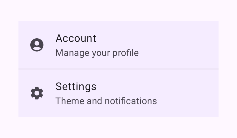
Skip to content
Containment

List Item

Headline, supporting text, and leading content rows

ListItem renders a single Material 3 list row with slots for headline, supporting text, and leading or trailing content. Wrap a column of them in a tonal Surface and separate them with dividers to build a settings-style list.

List Item demos rendered in Compose Playground
Pixel-accurate preview · light theme

Examples

01

List with dividers

Kotlin
Surface(tonalElevation = 2.dp) {
    Column {
        ListItem(
            headlineContent = { Text("Account") },
            supportingContent = { Text("Manage your profile") },
            leadingContent = { Icon(Icons.Filled.AccountCircle, null) }
        )
        HorizontalDivider()
        ListItem(
            headlineContent = { Text("Settings") },
            supportingContent = { Text("Theme and notifications") },
            leadingContent = { Icon(Icons.Filled.Settings, null) }
        )
    }
}