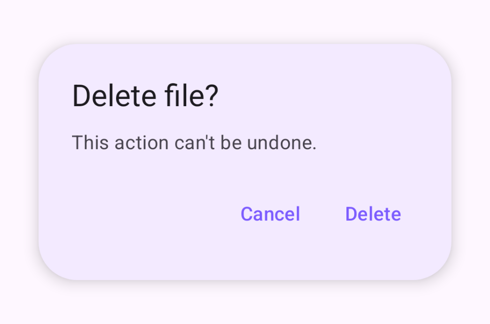
Skip to content
Communication

Dialog

AlertDialog confirmations and fully custom dialogs

Dialogs interrupt to request a decision or show critical information. AlertDialog gives you a ready-made layout with icon, title, body, and confirm/dismiss buttons, while the lower-level Dialog lets you place any content — such as a Card — in a modal window.

Dialog demos rendered in Compose Playground
Pixel-accurate preview · light theme

Examples

01

AlertDialog

A structured confirmation with confirm and dismiss buttons.

Kotlin
var open by remember { mutableStateOf(false) }
Button(onClick = { open = true }) { Text("Delete") }
if (open) {
    AlertDialog(
        onDismissRequest = { open = false },
        icon = { Icon(Icons.Filled.Delete, contentDescription = null) },
        title = { Text("Delete item?") },
        text = { Text("This action cannot be undone.") },
        confirmButton = { TextButton(onClick = { open = false }) { Text("Delete") } },
        dismissButton = { TextButton(onClick = { open = false }) { Text("Cancel") } }
    )
}
02

Custom dialog

Wrap any content — here a Card — in the low-level Dialog.

Kotlin
var open by remember { mutableStateOf(false) }
Button(onClick = { open = true }) { Text("Show card") }
if (open) {
    Dialog(onDismissRequest = { open = false }) {
        Card {
            Column(Modifier.padding(24.dp)) {
                Text("Custom content")
                TextButton(onClick = { open = false }) { Text("Close") }
            }
        }
    }
}