Styles
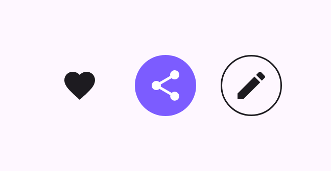
IconButton(onClick = {}) { Icon(Icons.Filled.Favorite, "Favorite") }
FilledIconButton(onClick = {}) { Icon(Icons.Filled.Share, "Share") }
OutlinedIconButton(onClick = {}) { Icon(Icons.Filled.Edit, "Edit") }Standard, filled, outlined, and toggle icon buttons
Icon buttons trigger a single action with a compact, recognizable glyph. They come in standard, filled, and outlined styles, plus a toggleable variant.
IconButton(onClick = {}) { Icon(Icons.Filled.Favorite, "Favorite") }
FilledIconButton(onClick = {}) { Icon(Icons.Filled.Share, "Share") }
OutlinedIconButton(onClick = {}) { Icon(Icons.Filled.Edit, "Edit") }An IconToggleButton flips between checked and unchecked.
var checked by remember { mutableStateOf(false) }
IconToggleButton(checked = checked, onCheckedChange = { checked = it }) {
    Icon(Icons.Filled.Favorite, if (checked) "Liked" else "Not liked")
}