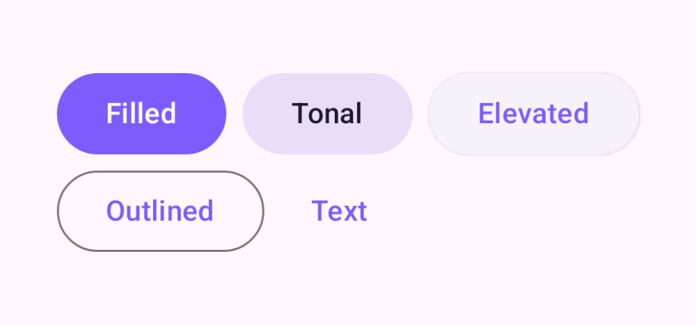
Skip to content
Actions

Button

Five emphasis levels from filled to text

Buttons let people take action. Material 3 ships five emphasis levels — filled (highest), tonal, elevated, outlined, and text (lowest) — plus support for leading icons and disabled states.

Button demos rendered in Compose Playground
Pixel-accurate preview · light theme

Examples

01

Emphasis levels

Pick emphasis to match a button's importance on the screen.

Kotlin
Button(onClick = {}) { Text("Filled") }
FilledTonalButton(onClick = {}) { Text("Tonal") }
ElevatedButton(onClick = {}) { Text("Elevated") }
OutlinedButton(onClick = {}) { Text("Outlined") }
TextButton(onClick = {}) { Text("Text") }
02

Leading icon

Kotlin
Button(onClick = {}) {
    Icon(Icons.Filled.Add, null, Modifier.size(18.dp))
    Text("  Add item")
}
03

Disabled

Kotlin
Button(onClick = {}, enabled = false) { Text("Filled") }
OutlinedButton(onClick = {}, enabled = false) { Text("Outlined") }